It’s been a while. And we’ve been busy. More on that later but for now, an announcement. Save the Date: 23-24 May 2024 How can authors find new ways of telling stories and reaching audiences? How can publishers move past dominant digital platforms, and reading experiences that are replicas of print? How can creative practitioners bring together the best of books, games and immersive experiences? We think it’s time to talk about the whole field of creative technology and publishing, and to do so provocatively, persuasively and with genuine passion. On 23-24 May, we’re putting together an event at Arnolfini in Bristol. Day 1 will be a showcase, with examples of Ambient Literature for you to experience, panel discussions and speakers from across the creative industries. Day 2 is an optional, hands-on workshop for authors, artists, game designers and other creatives looking to embed Ambient Literature in their own practice.…
The Voices of Place
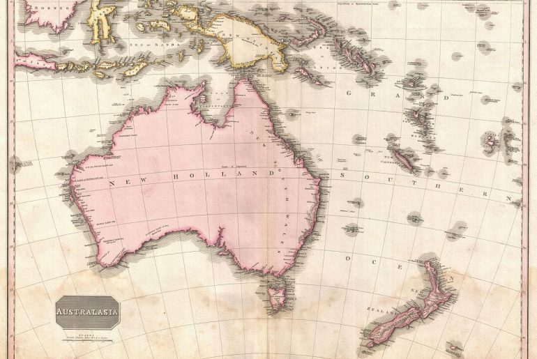
I’m travelling at the moment, lucky enough to have been in Australia, and now in New Zealand. At the start of some of the talks I’ve given out here, while the session is being introduced, some academics will give a mention to the indigenous peoples who’s lands have been variously occupied, forgotten, remembered, or generously offered so that we might gather there. It’s something you increasingly hear in Canada too, though I’ve never heard it in the States (maybe it happens at some institutions? I’d love to hear about it if so); I have no doubt the same politics of loss, theft, neighbourhood, and truce are present at a great many (most?) places across the globe, unevenly acknowledged. You can’t help but be struck by the different stories that we tell about the landscapes we inhabit once it’s called to mind: “this is the economics and sciences building, and it’s…
Approaching the End
As we approach the final months of the Ambient Literature project, the whole team find ourselves facing in at least two directions. We’re convening on a series of final events (more on which below), but are also spending our time drawing out conclusions and reflections regarding the last two years of work. When we began in May 2016, we were upfront about the challenges of the work we were going to make and address. Here’s what I said at the launch event at Hachette’s (then shiny new) headquarters in Blackfriars: Here’s an admission at the start of a research programme: We don’t know what Ambient Literature is. We’ve started to map the territory, to define by identifying borders and by testing the edges. It’s important to note though, that we don’t want to reduce the idea to something tight and defined, rather our intention is to open it up, so…
Breathe and Conditional Text
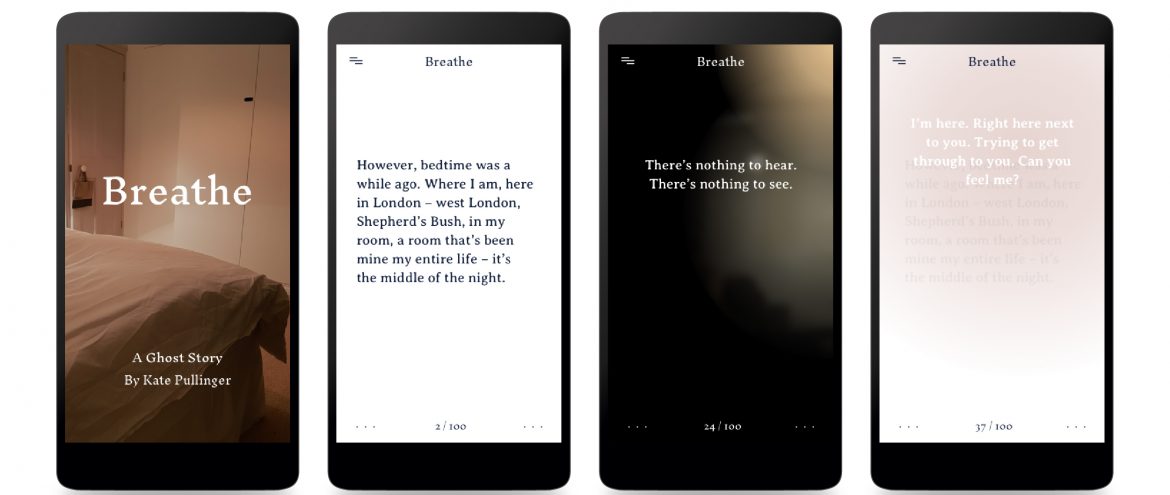
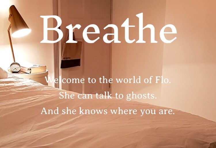
One of the most interesting things about Breathe (https://breathe-story.com/), the ghost story I created in collaboration with Editions at Play (Visual Editions and Google Creative Labs Sydney), and the Ambient Literature team, is its use of conditional text. Conditional text — text that alters in response to data that is pulled into the story via APIs — is embedded throughout Breathe. Now that the story has been out in the world for a few weeks it’s become clear to me that most readers are aware of only a small amount of the conditional text present in the story — those uncanny moments when the ghosts seem to know where you are as you read. On the one hand, this is great; we wanted the conditional text to be as subtle as possible, to work smoothly within the story. On the other hand, it’s kind of sad; only the most dedicated reader, who returns…
Tolle Lege
Under a fig-tree in a Milanese garden in the summer of 386 and in the throes of existential anguish, a prostrate and sobbing Aurelius Augustine — or, as we know him now, St Augustine — heard the voice of a child: “Pick up, and read, pick up and read” [tolle lege, tolle lege] At once my countenance changed. . . . I checked the flood of tears and stood up. I interpreted it solely as a divine command to me to open the book and read the first chapter I may find. . . . So I hurried back to the place that Alypius [Agustine’s companion] was sitting. There I had put down the book of the apostle [St Paul] when I got up. I seized it, opened it and in silence read the first passage on which my eyes lit: “Not in riots and drunken parties, not in eroticism…
“”Context Stinks!””
The title of this post is a quotation of the title of a 2011 article by Rita Felski that appeared in the journal New Literary History. Already set in quotation in the original, Felski’s title is itself a quotation from Bruno Latour, himself quoting Rem Koolhaas: As Rem Koolhaas said, “context stinks.” It’s simply a way of stopping the description when you are tired or too lazy to go on. (Latour, p. 148) Of course, Koolhaas is not famous for saying “context stinks,” but instead the more direct, “fuck context” (p. 502). Whatever the exact phrasing one might wish to use, the sentiment remains the same: across the various disciplines represented as the quotation has moved (literary criticism (Felski), sociology (Latour), architecture (Koolhaas)), the question and importance of context remains a persistent complication. What is interesting for us in particular, is that in tracing the movement of this quote from…
Looking Backwards, Looking Forward
As we experiment with and explore ambient literature as part of our project, we remind ourselves that what we are doing is not new. Countless writers, artists, and technologists have imagined and created digital works that respond to place to tell stories. As we examine these early roots of what we are calling ambient literature, we find that they are not definitive. We come across works in adjacent fields, in visual arts, geography, and oral history, that feel as though they are trying to experiment with technology, place, and story in similar ways. Here are just a few works from that might be considered early precursors to some of the ideas we are exploring today and might shape what comes next [murmur] (2002) was an archival audio project developed by a Toronto-based collective to record stories and memories told by people about specific geographical locations. The stories were mapped onto the urban…
Responding to Your Presence
Consider several apparently unrelated points of reference: On November 19th 1942, in the small Polish town of Drohobych, a man (amongst 230 others that Black Thursday) was shot on the street by an SS officer called Karl Günther. 1 Bruno Schulz was a writer, and left behind two volumes of extraordinary short stories, volumes of letters, drawings and paintings, and a novel that no-one on earth has ever read. Schulz was an adept of a technique of writing coined mytho-poesis, a poetic interpretation of life and its events through symbol, metaphor and allegory. His short fiction (collected as The Street of Crocodiles and Sanatorium Under the Sign of the Hourglass) are replete with symbolic figures, recurring characters and successive scenarios that taken together, build a world in which Schulz’ readers take a kind of refuge. His admirers include Cynthia Ozick, Jonathan Safran Foer, The Brothers Quay, and me. Writing is, I think, a…
Ambience & Eco Critical Awareness
After the launch of Duncan Speakman’s It Must Have Been Dark by Then in the Spring, we fell into a conversation about how, without aiming to, he had produced a work that seemed to speak to the idea of the anthropocene. Previously this had seemed to me a theoretical field full of problematic challenges, but the practice-based process has opened it up to me as an accessible and important way of framing the work of ambient lit. One of the features of ambient lit as we are experimenting with it has been to shift users’ attention between text and world, between present and past, and between presence and absence. Kate’s post about ghosts suggests some of this shape shifting. But Duncan & I, in a piece we’re working on for the new journal Media Theory, have been thinking about this in terms of modes of attention. Maybe these temporal and…
Session Promise
This blog will take approximately 2.5 minutes to read. At the recent FutureBook conference in London, The Bookseller’s annual book publishing and innovation jamboree, games consultant and writer Nicholas Lovell talked about a core idea behind the way content across all forms is delivered to us these days: the “session promise.” By this he means both the length of time the work requires of us to view, read, or play at any single sitting — the tv drama episode, the game level, the podcast serial — as well as the bargain we make with ourselves as we sit down to view: “I’ll just watch one episode of ‘Stranger Things 2.’” With the print book the session promise is so well established that it’s as invisible to readers as the printer’s rectangles Ian Gadd focuses on so elegantly in his most recent Ambient Literature blog. While I was not able to…


