The protagonist of Mark Haddon’s novel, The Curious Incident of the Dog in the Night-Time (2003) is a fifteen-year old, Christopher Boone, who discovers his neighbour’s dog has been killed. According to the back-blurb of the UK edition, he is described as having Asperger’s Syndrome, an identification that Haddon later regretted allowing; in the novel itself, Christopher refers only to his “Behavourial Problems” (59). Haddon represents Christopher’s world-view through a variety of non-verbal devices, including diagrams, drawings, mathematical formula, icons, and boldface. Less immediately obvious, perhaps, is the typeface itself: it’s sans-serif, which means it lacks the small hooks and extensions that you see in a typeface like Times New Roman. Sans-serif typefaces are usually used for display purposes, whether it’s the fire-exit, the next motorway junction, or the heading in a book. Serif typefaces, however, are conventionally used in newspapers and novels because they are meant to be easier to read at speed and at length.
Haddon’s choice of a sans-serif typeface is highlighted by the critic John Mullan who argued that the use of such a typeface ‘is almost physically uncomfortable in any lengthy text’ and that “[t]he font’s discomfiting simplicity is perfectly suited to Haddon’s narrator, Christopher, in all his pedantic veracity.” The effect for the reader, though, goes beyond mere discomfort. As Christopher himself remarks:
I see everything . . . most people are lazy. They never look at everything. They do what is called glancing. . . . And when I am in a new place, because I see everything, it is like when a computer is doing to many things at the same time and the central processor is blocked up and there isn’t any space left to think about things . . . most people are almost blind and they don’t see most things and there is a lot of spare capacity in their heads. (174, 177–8)
Readers in particular just glance. Although it may feel like our eyes are passing smoothly across a line of text, in fact they are performing a series of jerky snapshots, saccades: a single glance of 200-250 milliseconds takes in perhaps 15-20 characters; our eyes then shift about 7-8 characters to the right to take in another textual glance; and during that transition — a mere 25-30 milliseconds — we are functionally blind.
The speed with which we can perform this and the number of characters we can “see” in a single glance depends on many variables, including the language of the text and our general reading proficiency. The choice of typeface also plays a role, and this is where Haddon’s sans-serif is so effective. Most readers do not usually notice the typeface they are reading unless there is something very distinctive about it, and the typeface Haddon uses (which I believe to be Frutiger) is perfectly legible; however, our lack of conditioning for this kind of typeface in this kind of context creates a cognitive “drag” as our eyes, and brains, adjust. For a while, we are unexpectedly conscious that we are looking as we read — a contextual distraction that, in a diminished way, mimics Christopher’s own hyper-perception. After a while, we may shake of that feeling — our looking becomes glancing again — only to rediscover it as we pick up an article or book set in a conventional serif typeface.
(You can get a sense of the difference by looking at the “Look inside” previews of the print and Kindle edition on Amazon. Intriguingly, the US edition of the novel did not reproduce the sans-serif.)
Type-designers often use “readability” to describe the cognitive “drag” of a typeface. The typographer Beatrice Warde distinguishes between readability and legibility:
A page set in 14-pt Bold Sans is, according to the laboratory tests, more “legible” than one set in 11-pt Baskerville. A public speaker is more “audible” in that sense when he bellows. But a good speaking voice is one which is inaudible as a voice. . . . Type well used is invisible as type, just as the perfect talking voice is the unnoticed vehicle for the transmission of words, ideas.
Warde’s recurring motif throughout (and which gives the essay its title) is the “crystal goblet” whose purpose is to convey “the vintage of the human mind.” Declaring that “[t]here is nothing simple or dull in achieving the transparent page,” she reminds her audience and readers “that thousands of people pay hard-earned money for the privilege of reading quietly set book-pages.” This may be so, but the silence of the page is something we as readers have to learn not to hear. We may agree with Warde that Baskerville is a beautifully readable typeface but there is nothing innate about such readability. Up to World War II, Germany and Scandinavia routinely used fraktur typefaces (what we could call gothic or black letter) for book printing, and although we may struggle to decipher it, we can’t assume that the original readers of Goethe or Mann found it anything other than easy to read. Readability is relative and Warde’s “transparent or invisible typography” is a carefully crafted illusion. Moreover, just because we do not see it does not mean it is not in some way shaping our experience. The scholar D.F. McKenzie argues that all aspects of a book’s physical form mediate our engagement with the text it contains:
The material forms of books, the non-verbal elements of the typographic notations within them, the very disposition of space itself, have an expressive function in conveying meaning . . . Forms effect meaning.
In other words, while Baskerville may seem more “invisible” than Frutiger, both affect how we read — and what we might think. In 2012, a typographic experiment conducted on some 40,000 readers of The New York Times suggested that certain typefaces exuded more natural “authority,” and that out of six different typefaces there was one that, more than the others, “promotes, engenders a belief that a sentence is true . . . [o]r at least nudges us in that direction”: Baskerville.
The choice of typeface for a book is traditionally left to publishers rather than authors. However, the typeface is never fully neutral: it shapes a reader’s perceptions and expectations, albeit in subtle ways. Moreover, as Haddon’s novel shows, a typeface can be crucial to a work’s literary effect. The way in which a work’s meaning can be creatively shaped by material and contextual factors — whether that is typeface or medium or location — is crucial to what ambient literature is attempting to achieve. Its goal is to show authors and readers that reading can be more than simply a glance.
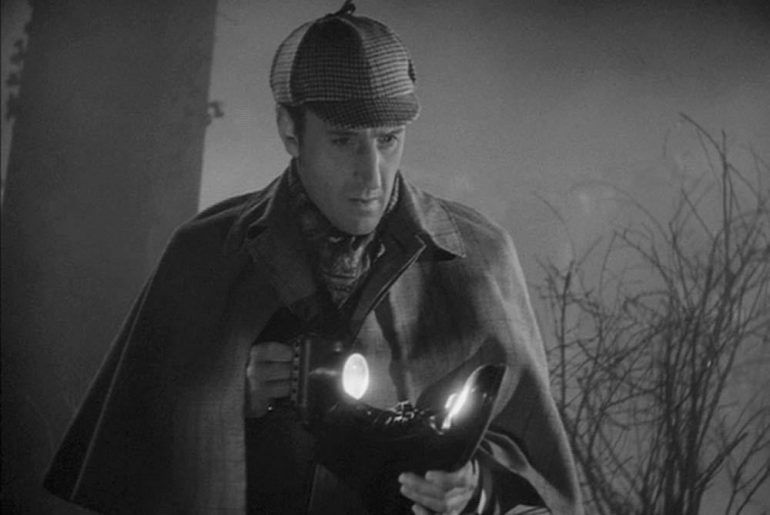
(Oh, and Christopher Boone’s favourite book? That would be the Hound of the Baskervilles . . .)
—Ian Gadd


